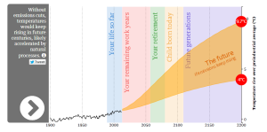
After much anticipation, the U.N. recently released its Fifth Assessment Report on climate change, leaving us with more certainty than ever that we need to do more to address the effects of climate change
In case you don’t have the time to read over the entire 900-page document we recommend a few visual aids that can help you understand some of the report’s major findings and what their implications will be for life as we know it.
To see how the U.N. projects temperatures could change over your lifetime, check out The Guardian’s interactive graphic, which allows you to input your birthday and see how much the planet has already warmed over your lifetime and how much hotter it will get. According to The Guardian’s analysis, if the world continues along with business as usual, a child born today would see rise of 2.7 – 6.3 degrees Celsius in his or her lifetime. To put that in perspective, 4 degrees was enough to take the planet out of the last ice age.

Because of the long time span and the detail of The Guardian’s graph, you can also see how temperature fluctuations have varied over time while exhibiting a clear general upward trend. This is especially important given the reactions of many climate skeptics to the lull in temperature increases over the last 15 years. As the graph shows, however, there’s no reason to believe this lull will continue if we continue business as usual.